
WoMen of Connections Ministry
Redesigning a Donation Page
Women of Connection Ministry aims to create a transformative donation experience that resonates with its global vision: to fill resource gaps with high-quality support that uplifts students and communities in need. By focusing on a mission to educate and empower individuals of all ages, we seek to inspire donors to join us in fostering prosperity for both international and native-born citizens. Our redesigned donation page will highlight impactful stories and seamless giving options to strengthen connections and amplify generosity.
About WoMen of Connections
WoMen of Connections Ministry is a Non-profit organization, offers education and resources support to students, adults, single parents, immigrants and US born citizens. The website’s goal is to improve the quality of support to reach all individuals who are in need of educational resources, Internships, providing them with the necessary support to excel academically, earn their high school diplomas, and pursue post-secondary education.
Responsibilities
- User Research
- User Persona
- Old Website Analysis
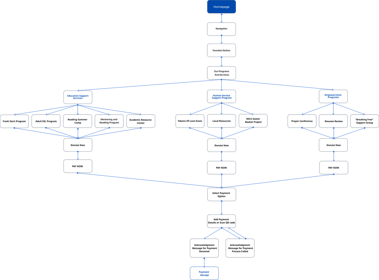
- Information Architecture
- Lo-fi & Hi-fi Wireframes
- Design System- Layout grid, Spacing, Typography, Color Palette, Icons, Buttons
Meet the Team
UX/UI Designers
Prateeksha Vijay Gawande
UI Developer
Prateeksha Vijay Gawande
Team Lead
Akshat Sonar
Duration of Project
4 Months
Tools Used
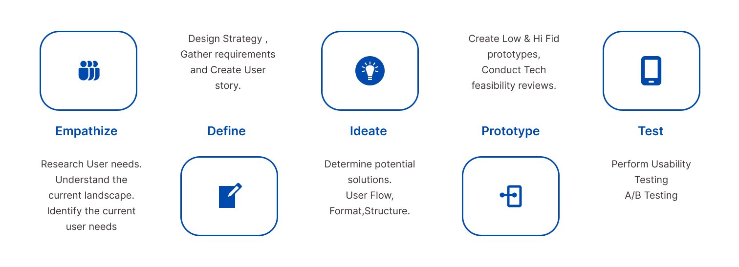
My Design Process
Style Guide
Color Palette

Icons
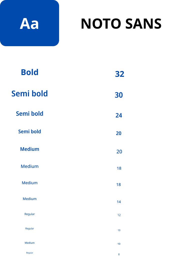
Typography
Problem
- Is the navigation intuitive and straightforward for users wanting to make a donation?
- Do users find the donation page simple and easy to use?
- Does the design and aesthetics of the donation page meet users’ expectations for an engaging experience?
- Does the donation page feel engaging to users?
- Do users perceive the donation process as quick and efficient?
- Are users aware of the specific programs their donations will support?
- Do users know they have the option to donate directly to the CEO or make a general donation that can be allocated to any program within the NGO?
Solution
To answer these questions, I completed the following steps:
- Competitive Analysis
- IA Audit & Sitemap
- Navigation Sitemap &
- Card Sorting
- User Surveys
- Prototype & UI Design
User Research
Based on our user research with Ms.Adewusi and other Advisory groups of WoMen of Connections and interviews, I was able to find the patterns and behaviors.
Insights
Insight 1
Need for a Simple and Transparent Donation Experience:
Our donors, both new and returning, want an easy and transparent way to donate. We need to provide clear instructions, show exactly where their money is going, and explain the impact of their donation. This will help build trust and encourage more donations.
Insight 2
Importance of an Engaging and Visually Appealing Design:
Donors expect a meaningful experience when supporting our cause. A well-designed donation page that reflects our values, with inspiring images and clear information, will create an emotional connection. A professional, distraction-free design will also appeal to tech-savvy and high-impact donors, strengthening our credibility and attracting more significant contributions.
Pain Points
- Complexity and Usability: The donation process feels overwhelming and complicated, making users uncertain about how to proceed.
- Uninspiring Design: The page lacks engaging visuals and design, reducing users’ motivation to donate.
- Lengthy Process: The donation process seems too slow or cumbersome, leading to frustration and potential drop-offs.
- Lack of Program Clarity: Users don’t fully understand which programs their donation supports, making them hesitant to contribute.
- Limited Awareness of Donation Options: Users aren’t informed about alternative options, like donating directly to the CEO or making a general donation, leaving them feeling restricted.
- Unclear Impact Communication: The page doesn’t effectively convey the impact of donations, causing users to question the significance of their contributions.

Target Audience

- Existing Supporters
- Potential New Donors
- Individuals Interested in Specific Programs
- Corporate and Business Donors
- High-Impact Donors
- Recurring Donors
- Tech-Savvy Donors
Empathy Mapping
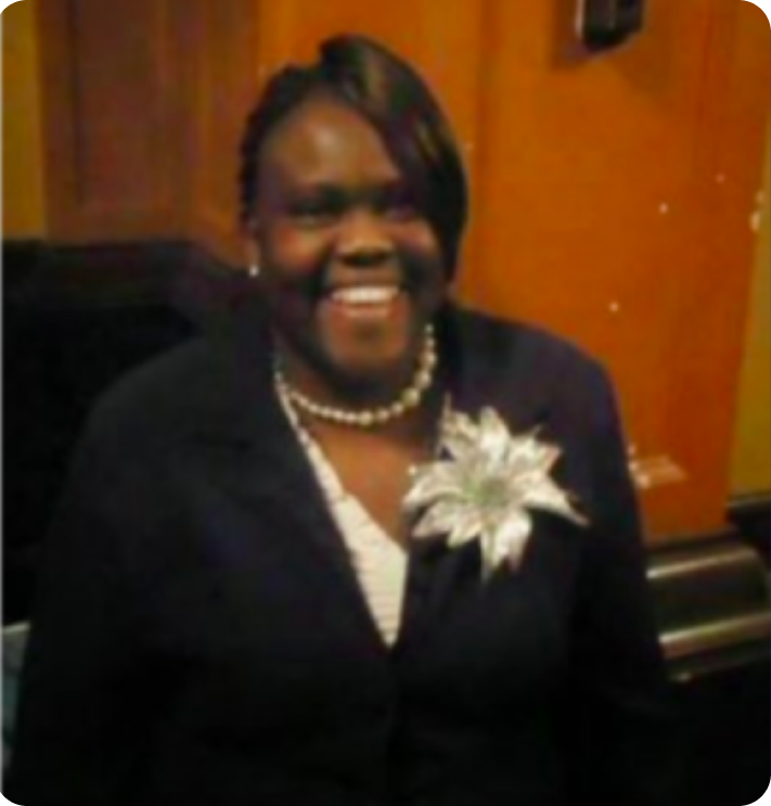
- “Our donors deserve an experience that is simple, transparent, and impactful. We need to make it clear how their contributions will make a difference.”
- “It’s important for us to present the value of what we do in an inspiring and professional way. The donation page should reflect the heart of our mission and engage our supporters emotionally.”
Says
- Ensures the donation process is straightforward and transparent, with clear guidance and explanations at each step.
- Works on improving the design and visuals of the donation page, ensuring it aligns with the values of WoMen of Connections Ministry and is engaging for users.
- Actively communicates the impact of donations through program-specific information and compelling calls to action.
Does
Thinks
- “Donors want a straightforward, easy-to-navigate page where they feel confident in how their money will be used.”
- “A professional, clean design is essential. It’s not just about aesthetics it’s about creating a meaningful experience that resonates with both individual and corporate donors.”
Feels
- Concerned that the current donation page may feel complicated or unclear, potentially discouraging some users from completing their donations.
- Passionate about creating a meaningful, impactful experience for donors that not only motivates them to give but also reflects the professionalism of the ministry.
- Optimistic that improving the design and clarity will lead to greater engagement and higher conversion rates, allowing the organization to expand its impact.
User Persona

Name:
Age:
Location:
Occupation:
Miss. Aanu-Oluwapo Adewusi
53
WoMen of Connections Ministry Inc, 101 Cowardin Ave, Suit 103B, Richmond, VA. 23224
CEO (WoMen of Connections Ministry)
Bio
Ms. Adewusi is dedicated to ensuring the growth of WoMen of Connections Ministry by gaining donor trust and support. She aims to create a seamless, transparent, and engaging donation experience for a diverse audience, including individual supporters, corporate donors, and philanthropists, with the goal of increasing conversions and driving more support for the organization’s mission.
Pain Points
- Complexity and Usability
- Uninspiring Design
- Lengthy Process
- Lack of Program Clarity
- Limited Awareness of Donation Options
- Unclear Impact Communication
Goals
- Simplify the Donation Process
- Enhance Transparency
- Improve Visual Design
- Make the Process Quick and Efficient
- Communicate Impact
- Increase Awareness of Donation Options
Competitor Analysis
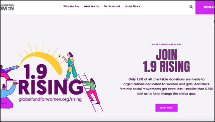
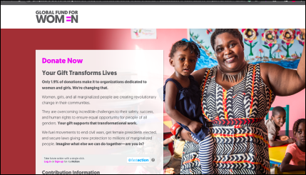
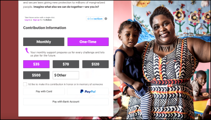
Before starting the redesign, I conducted a competitor analysis and compared the donation pages of other nonprofit websites with the
current website of Women of Connection.
MOUNTAIN OF FIRE
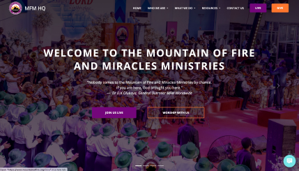
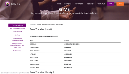
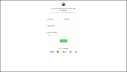
Global Fund for Women
Information Architecture
High Fidelity Prototype
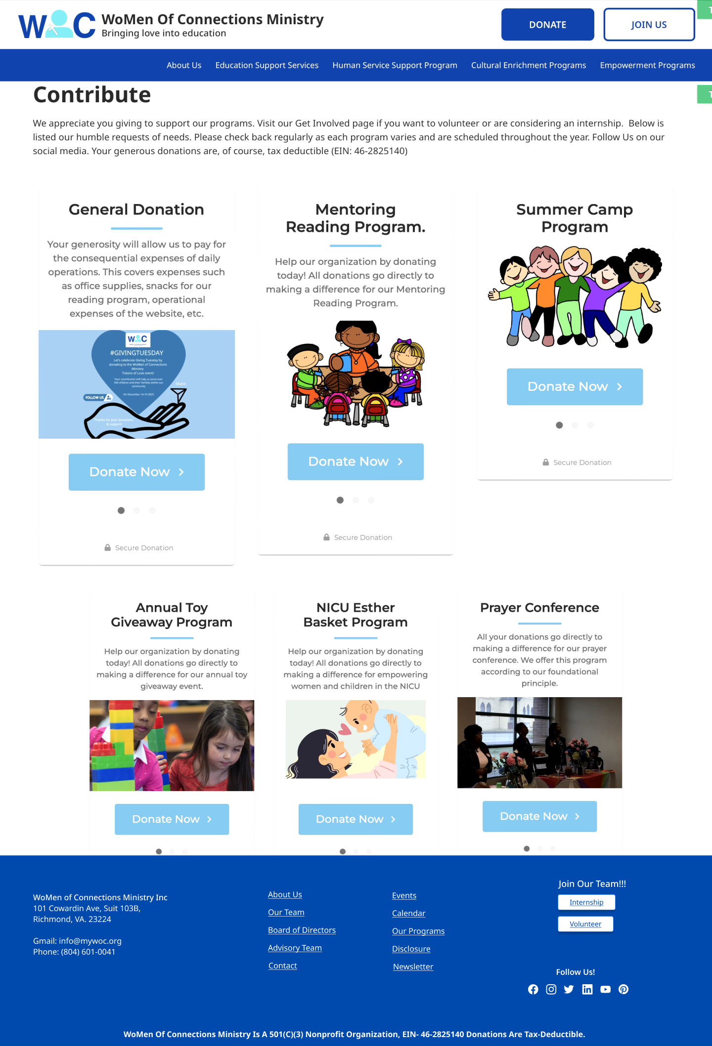
Original Design
The original donation page presents several pain points that hinder its effectiveness: the donation process feels overly complex and slow, causing frustration and drop-offs; the design lacks engaging visuals, failing to inspire users to contribute; unclear communication about programs and donation impact leaves users hesitant and questioning the significance of their contributions. Additionally, limited awareness of alternative donation options makes users feel restricted and uncertain about how to proceed.
Redesign Process
After understanding the pain points presented by the client, Ms. Adewusi, I began working on redesigning the donation page to address these issues. I followed a user-centered approach, incorporating user research and the design thinking process: empathizing, defining, ideating, prototyping, and testing. Through one-on-one interactions with the client and based on her initial requirements, I created this first design high-fidelity prototype.
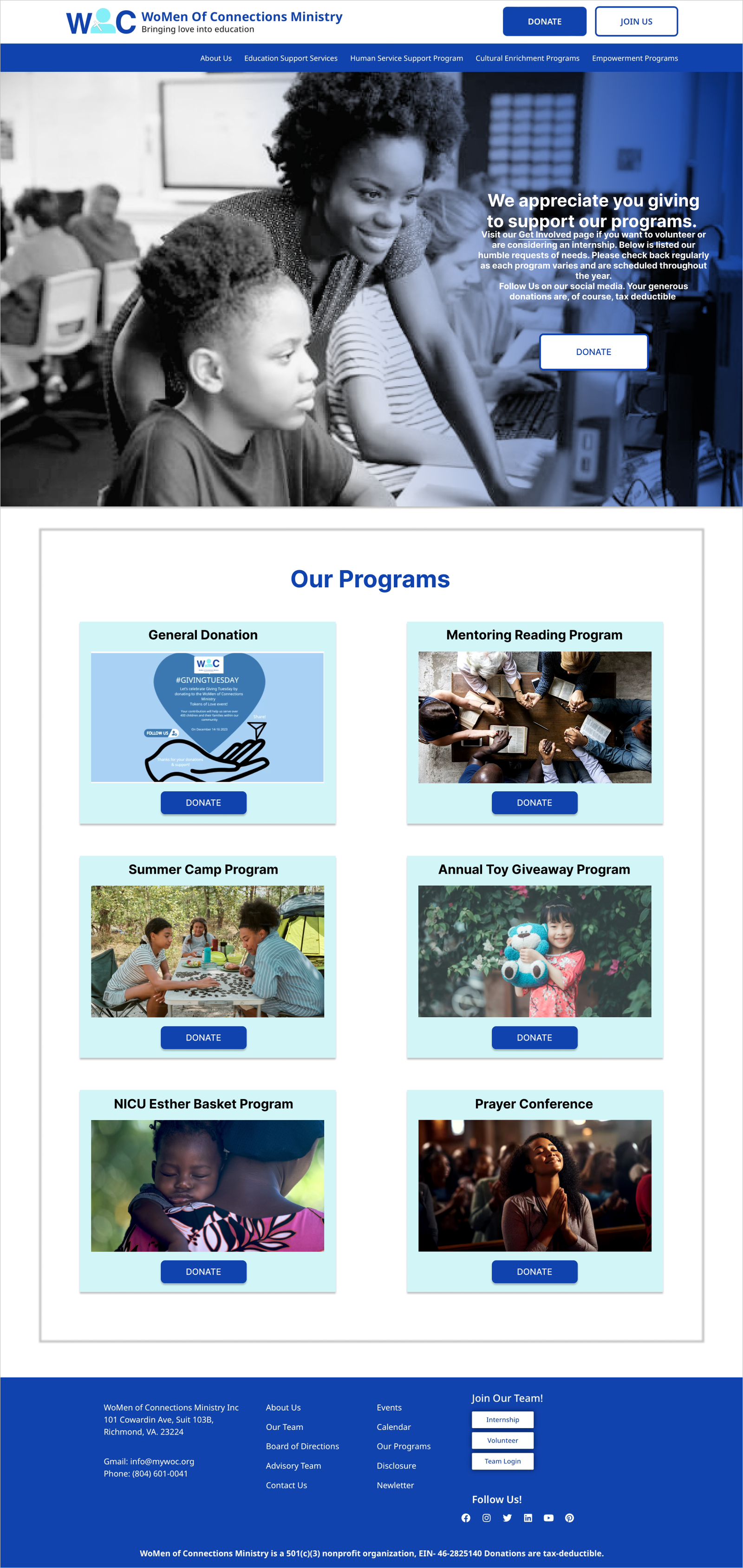
Refining the Design
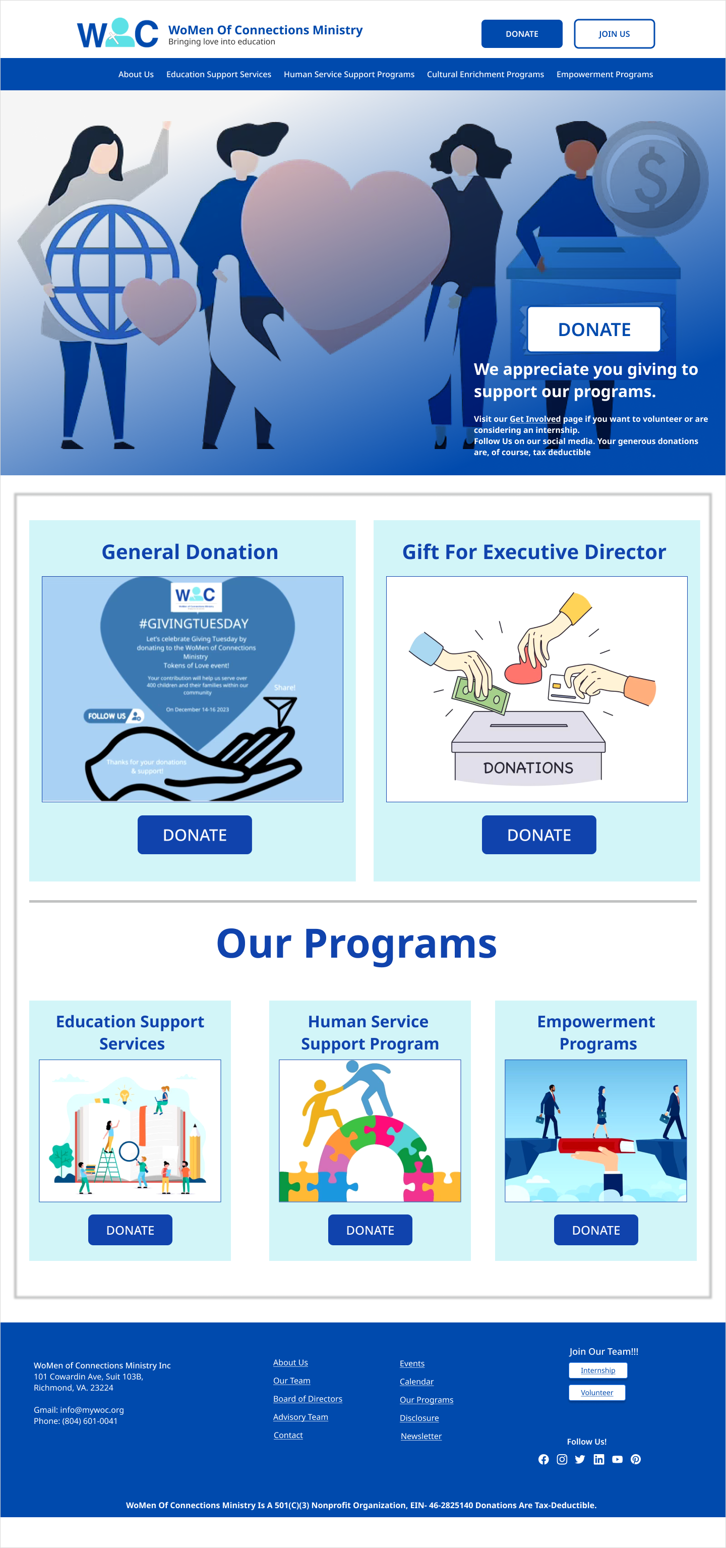
Based on further feedback from Ms. Adewusi and the committee, I began refining the design to better meet their requirements. Some of the changes made to the first design include grouping several individual programs under a few common domains, addressing concerns that the images did not represent all communities in the USA, and replacing images of real human faces with illustrations.
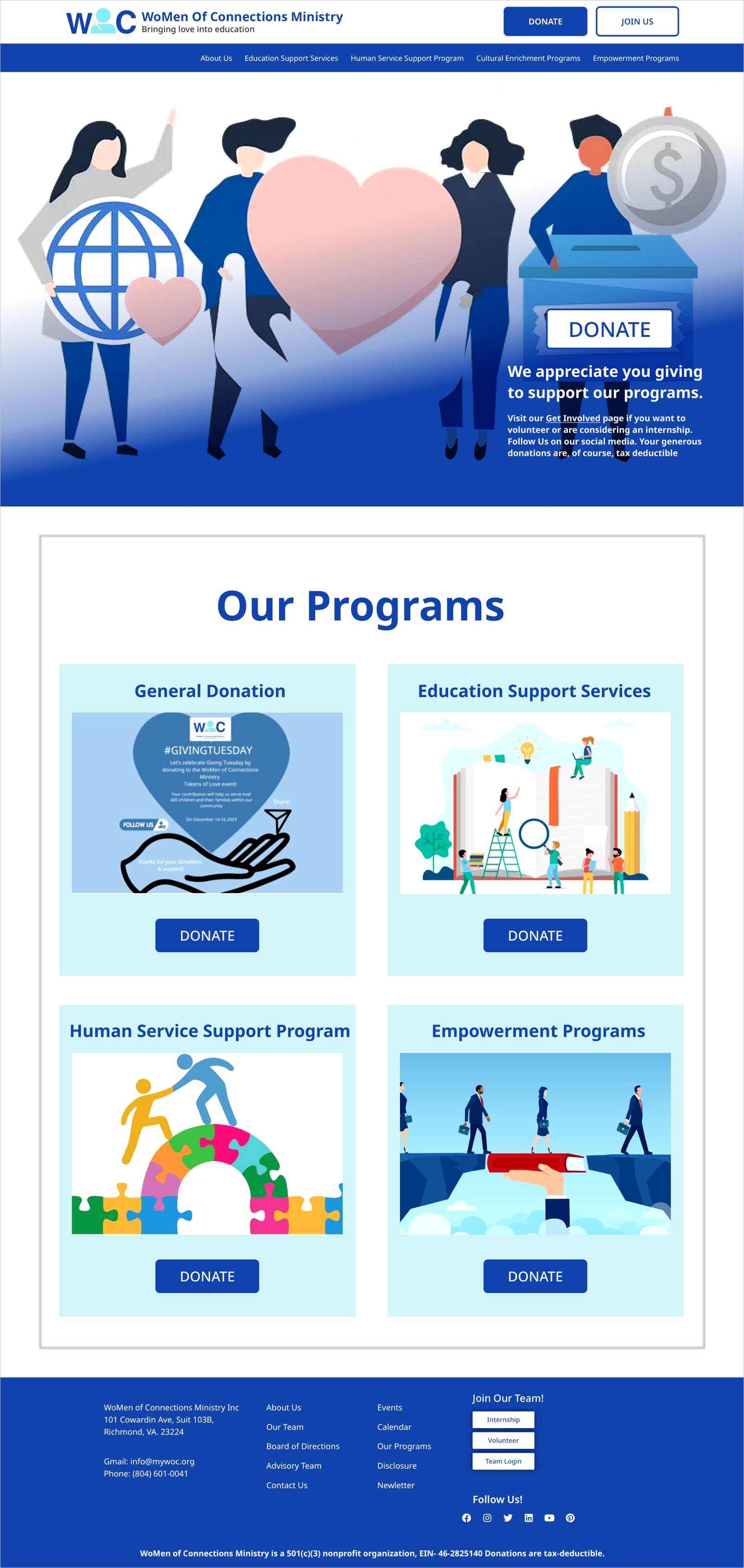
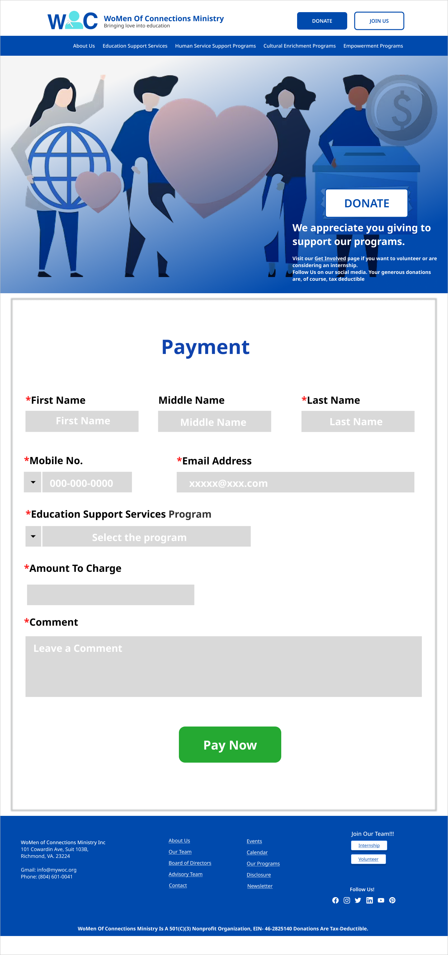
Furthermore, Ms. Adewusi and the committee emphasized the importance of transparency with donors. They requested that all programs under each domain be displayed as dropdown menu options on the payment page, allowing donors to easily select the specific programs they wish to support.
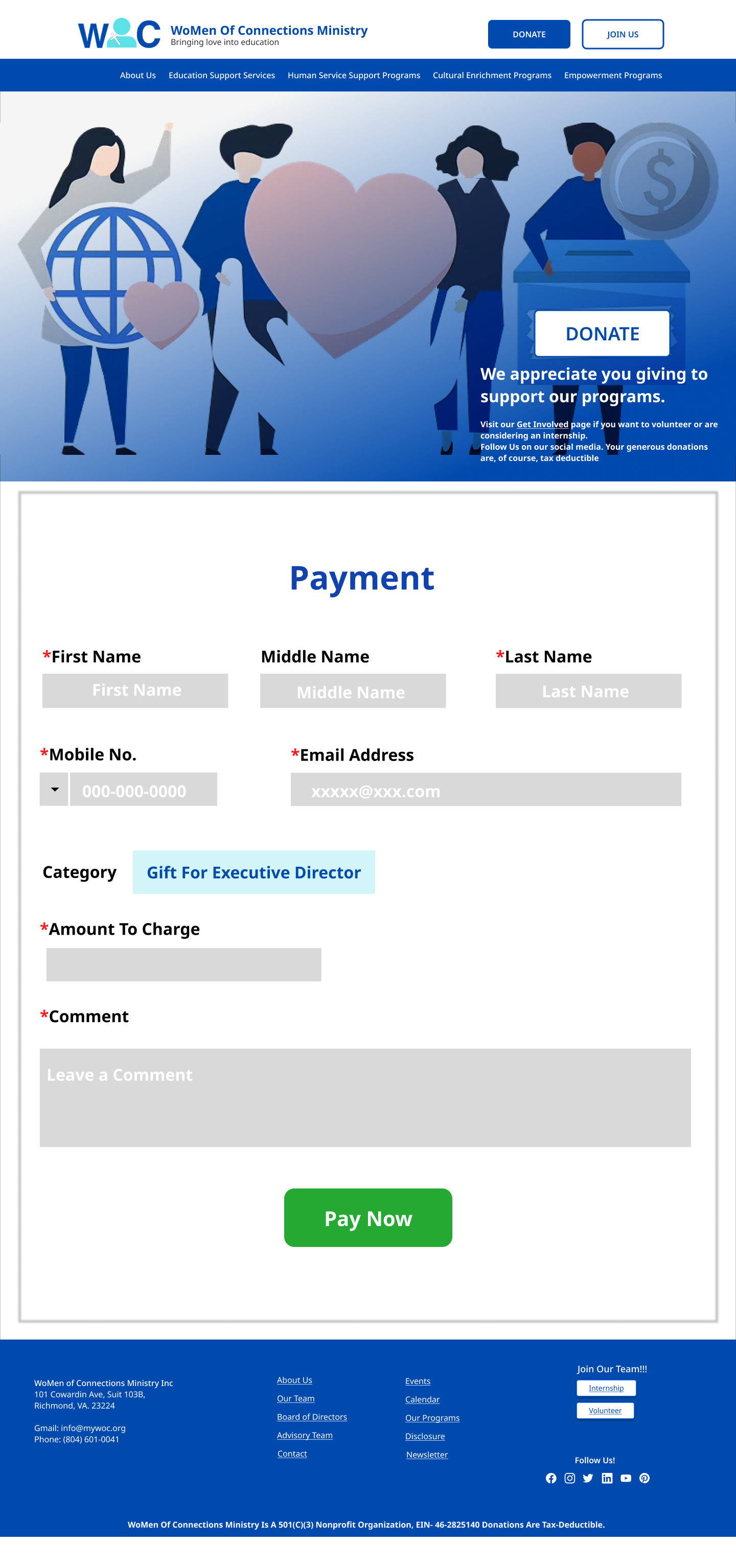

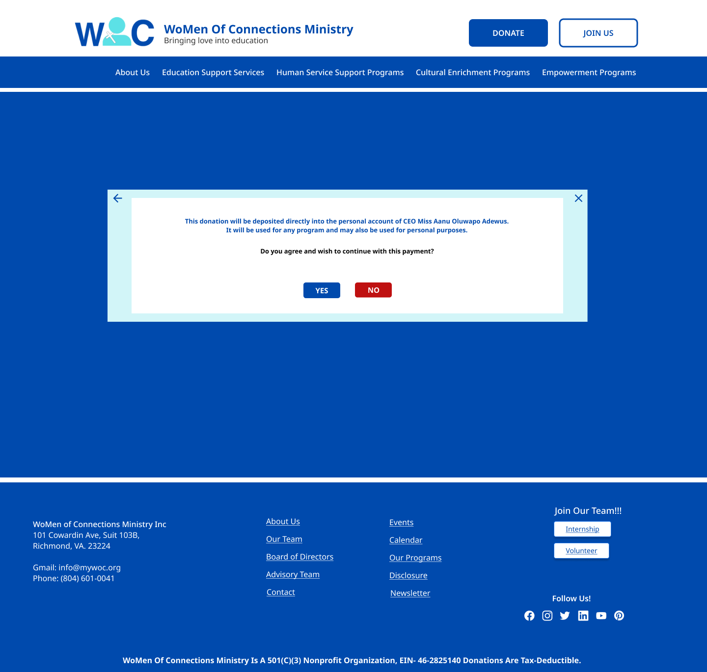
A “Gift for Executive Director” section was added, allowing donors to make personal contributions to the executive director. These donations will be used to support the NGO’s development.
Final Design
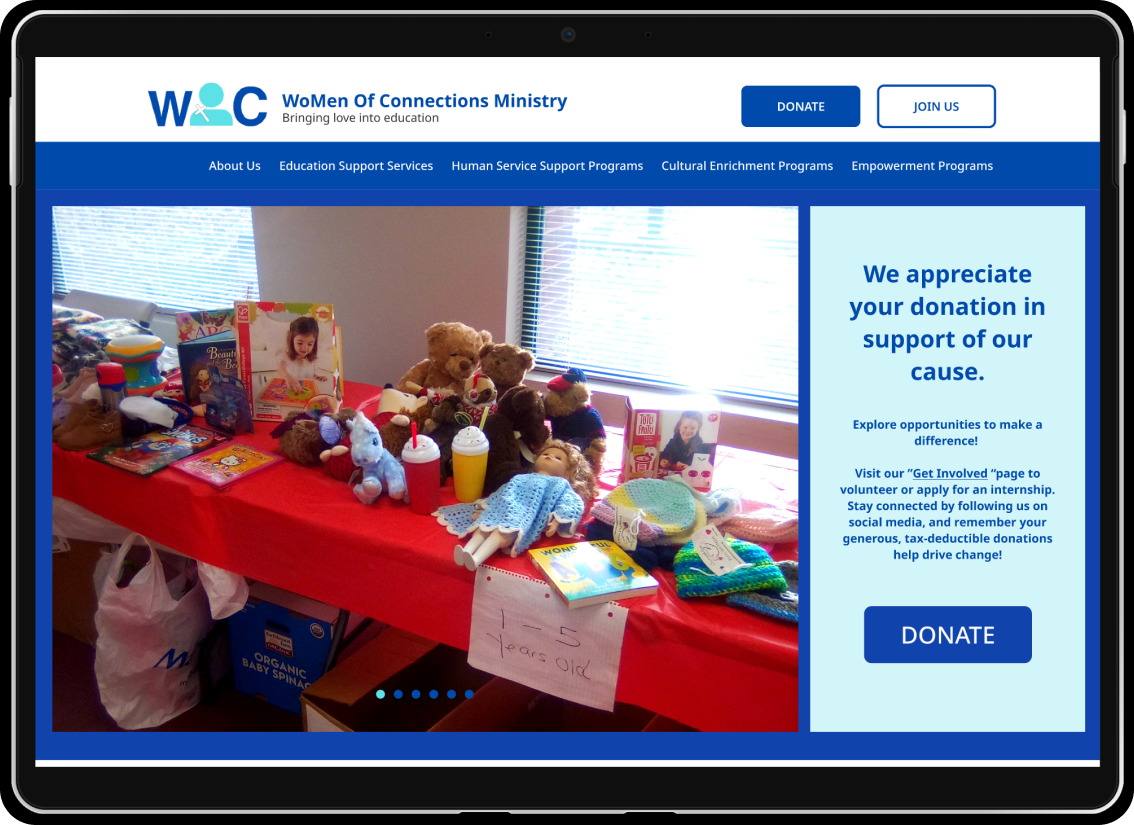
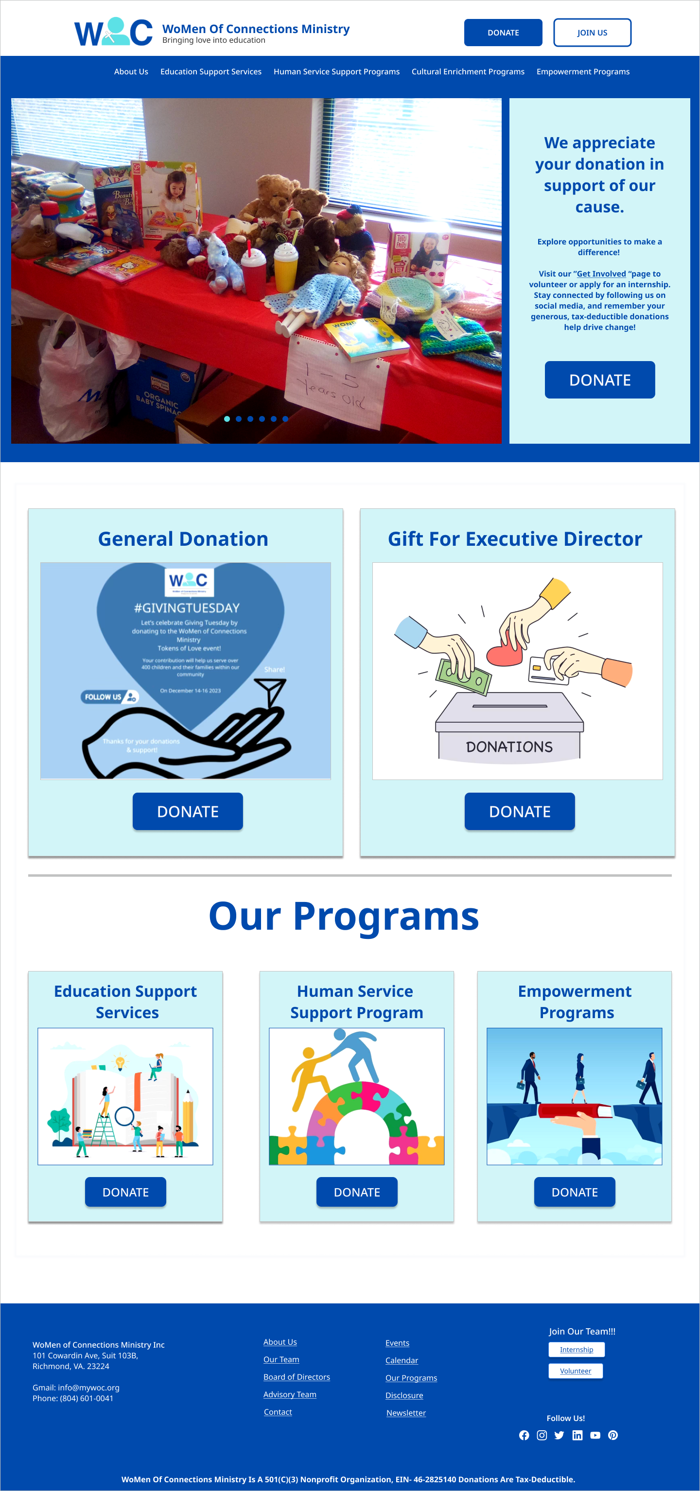
For the final design, Ms. Adewusi was not satisfied with the front-page illustration. I suggested she provide pictures from past donation programs to showcase the organization’s previous work and inspire donors to support other programs. I then incorporated these images into a carousel on the front page.
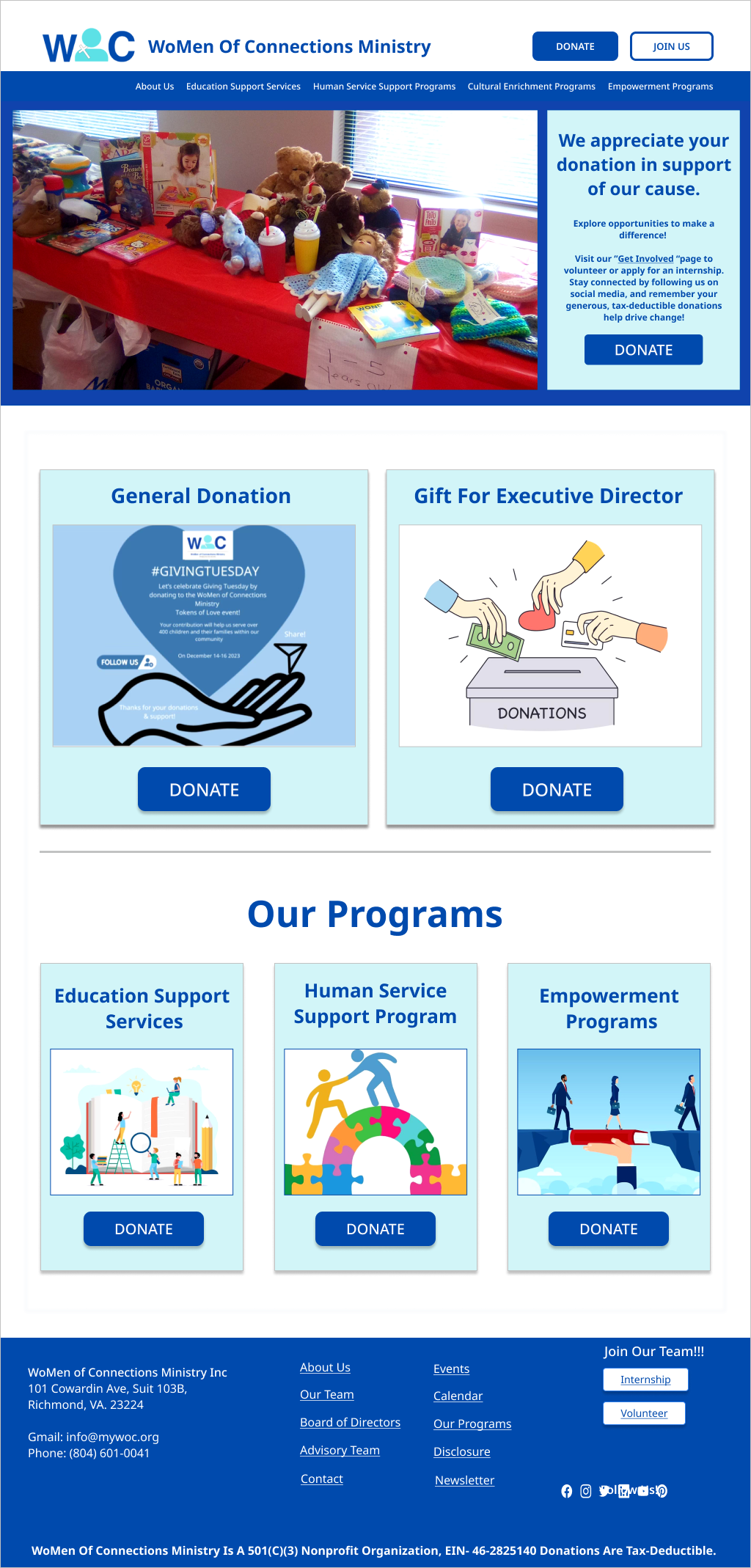
Final Design - Mobile Version

Final Design - iPad Version
Final Payment Designs
General Donations Payment Pop-Up Window
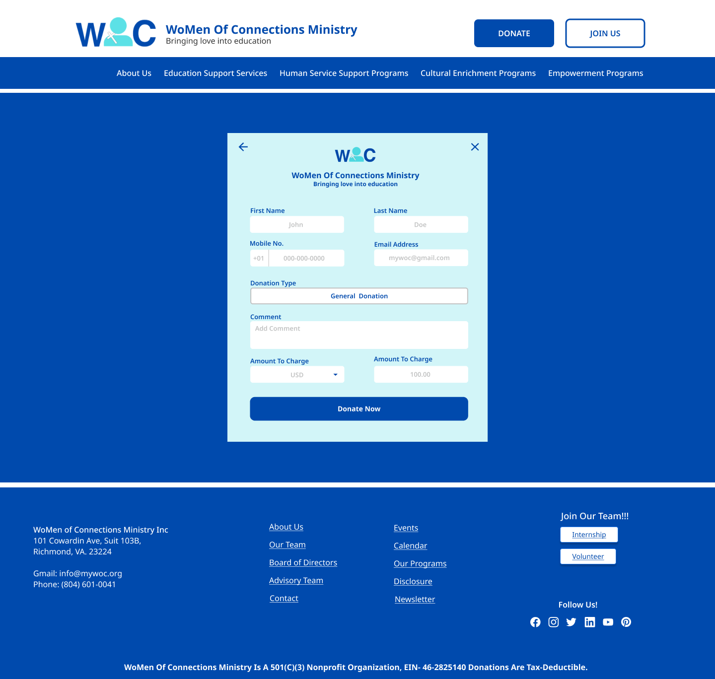
Gift for Executive Director – Pop-Up Window

Gift for Executive Director – Confirmation Pop-Up Window
Donation for Education Support Services Program –
Pop-Up Window

Dropdown for Education Support Services Program Sub-Categories – Pop-Up Window

Donation for Human Services Support Programs –
Pop-Up Window

Dropdown for Human Services Support Program Sub-Categories –
Pop-Up Window

Donation for Empowerment Programs –
Pop-Up Window

Dropdown for Empowerment Program Sub-Categories –
Pop-Up Window

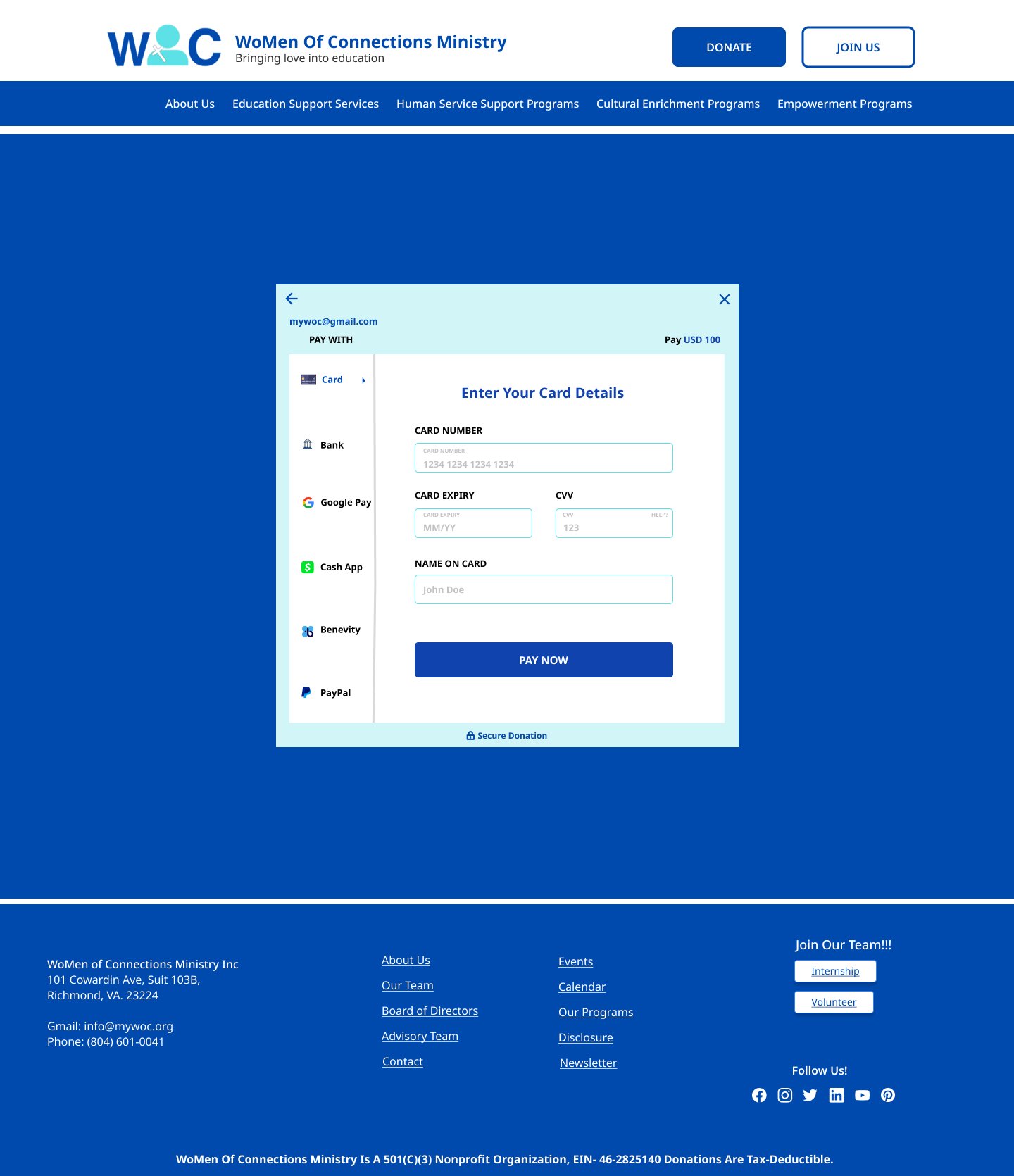
Credit/Debit Card Pop-Up Window
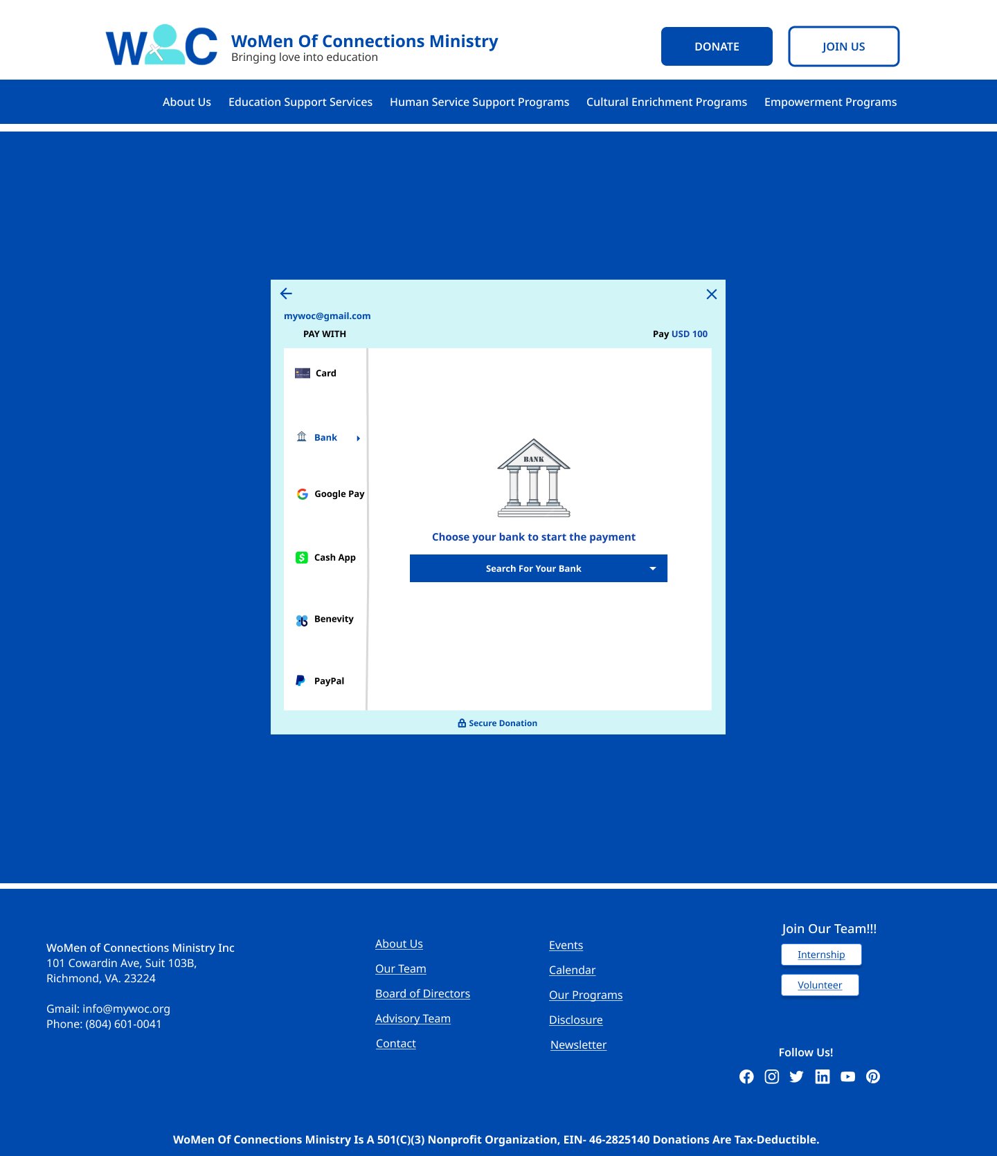
Bank Payment Pop-Up Window
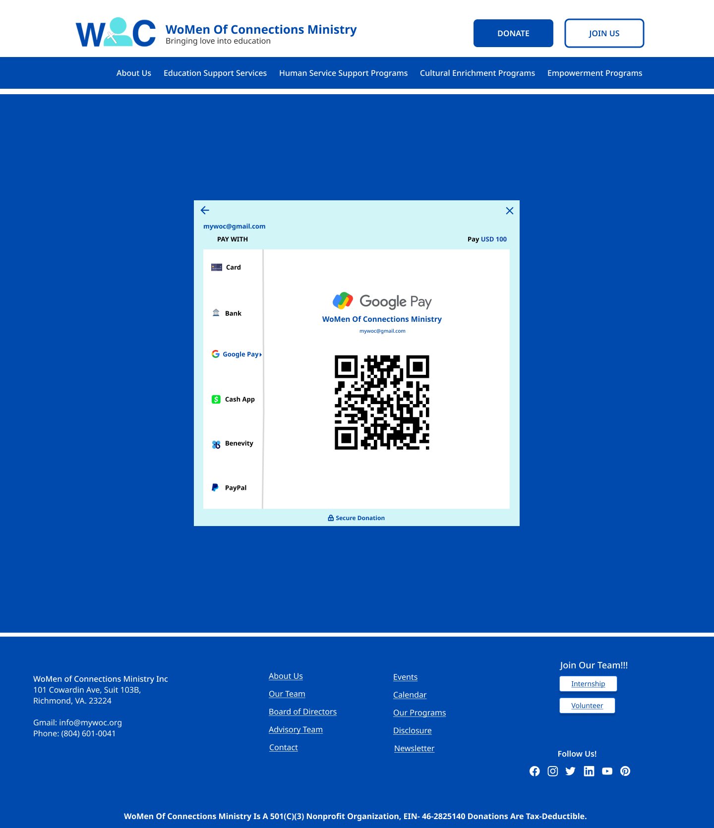
Google Pay Pop-Up Window
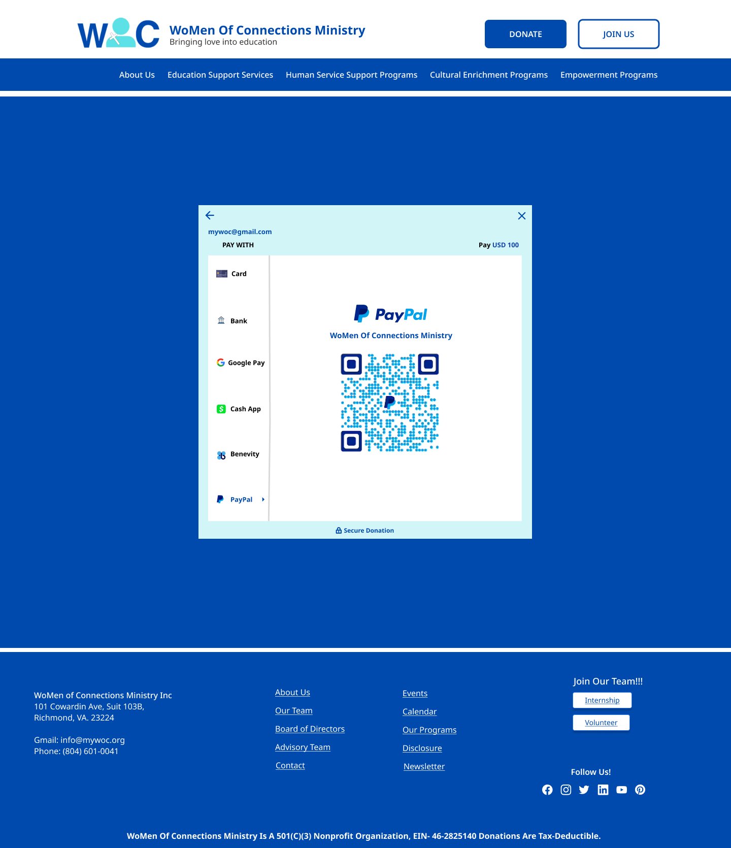
PayPal Pop-Up Window
Accessibility Testing with WCAG Standards
Color Contrast


Typography


