
Heuristic Evaluation
About Hers
Hers, part of Hims & Hers Health, Inc., is a telehealth platform focused on delivering accessible and high-quality healthcare solutions tailored for women. The company offers online access to treatments for hair care, skin health, mental wellness, sexual health, weight management, and more. Popular products and services include treatments like birth control, libido pills, oral minoxidil, anti-aging creams, and medications such as propranolol and bupropion. Hers emphasizes privacy, simplicity, and trust, enabling women to manage their health confidently and conveniently through medical consultations, prescriptions, and direct product delivery.

Jakob's 10 Usability Heuristics

Visibility of System Status
Designs should keep users informed with timely feedback.


Issue: Users cannot see the status of their order during processing or when it will be delivered
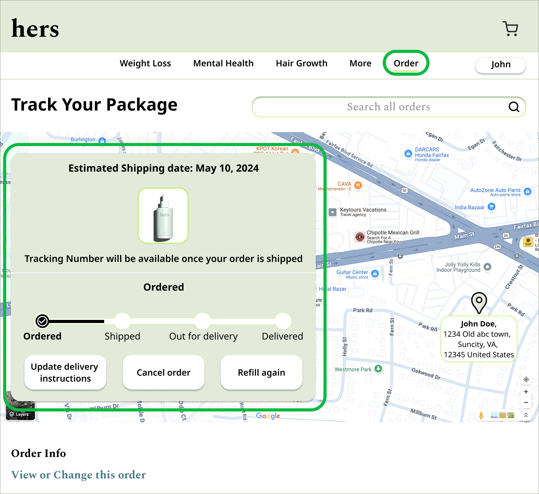

Solution: Add real-time order tracking with clear indicators for each step (e.g., “Processing,” “Shipped,” “Out for Delivery”). A visible status bar on the order details page can guide users effectively.
Match Between System and the Real World
Use terms and flows familiar to users.


Issue: The site hides order details under the user account, which is not intuitive or aligned with user expectations.
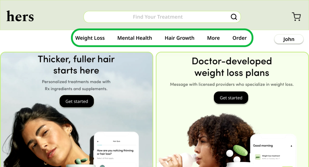

Solution: Create a prominent “Orders” section in the main navigation bar for quick access, similar to popular e-commerce sites.
User Control and Freedom
Users need a clearly marked “emergency exit.”
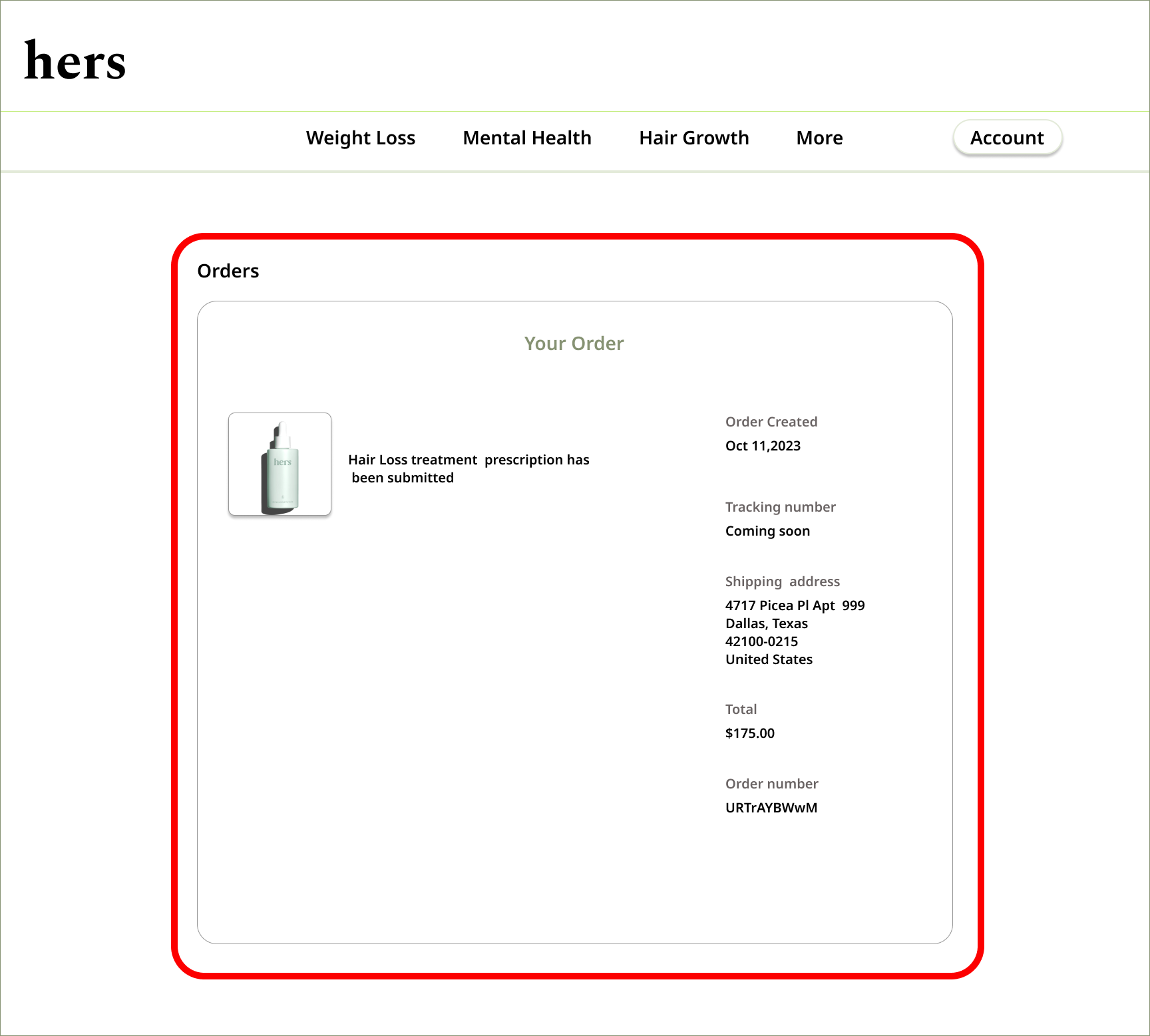

Issue: There is no option to cancel an order if the user changes their mind or makes a mistake.
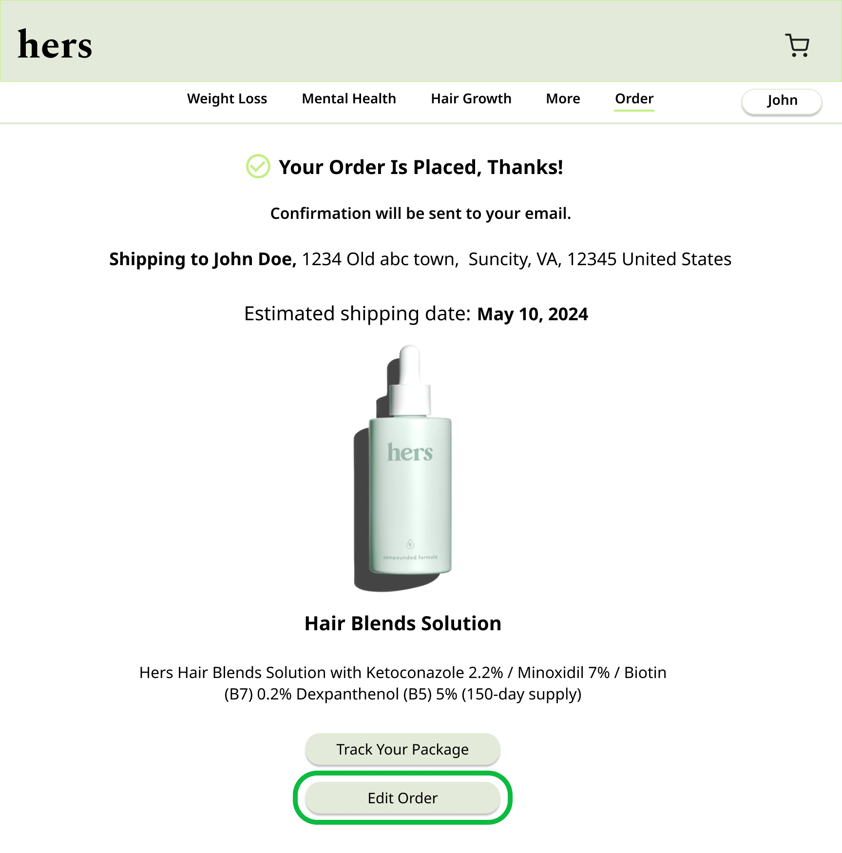

Solution: Include a “Cancel Order” button with clear terms for eligible orders.
Consistency and Standards
Follow established platform conventions.
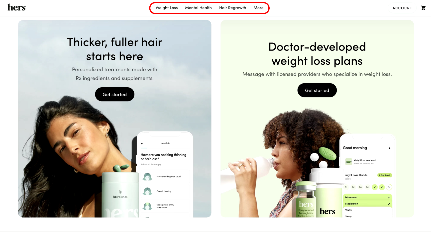

Issue: Lack of a “Search” option on the homepage breaks a common user expectation for e-commerce platforms.
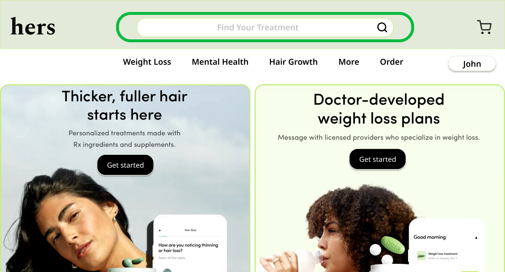

Solution: Implement a prominent search bar on the homepage to help users easily locate treatment or product.
Error Prevention
Prevent problems before they occur.


Issue: Without clear delivery status or order details, users may place duplicate orders or repeatedly contact customer support.
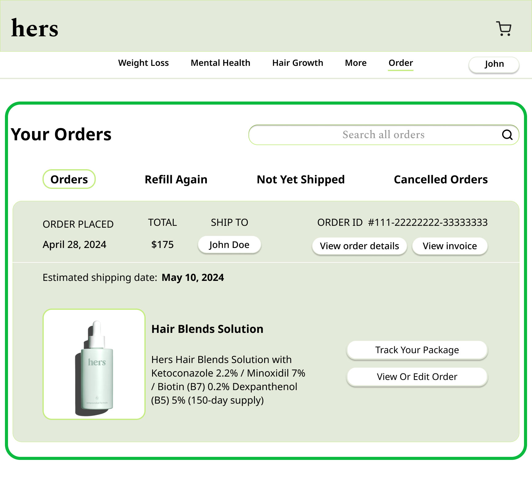

Solution: Display a confirmation page clear order details after purchase. Include order tracking links to reduce confusion.
Recognition Rather Than Recall
Minimize memory load by making key elements visible.


Issue: Users struggle to place orders, cancel them, or view the estimated delivery time due to the absence of visible options on Order Checkout Page.
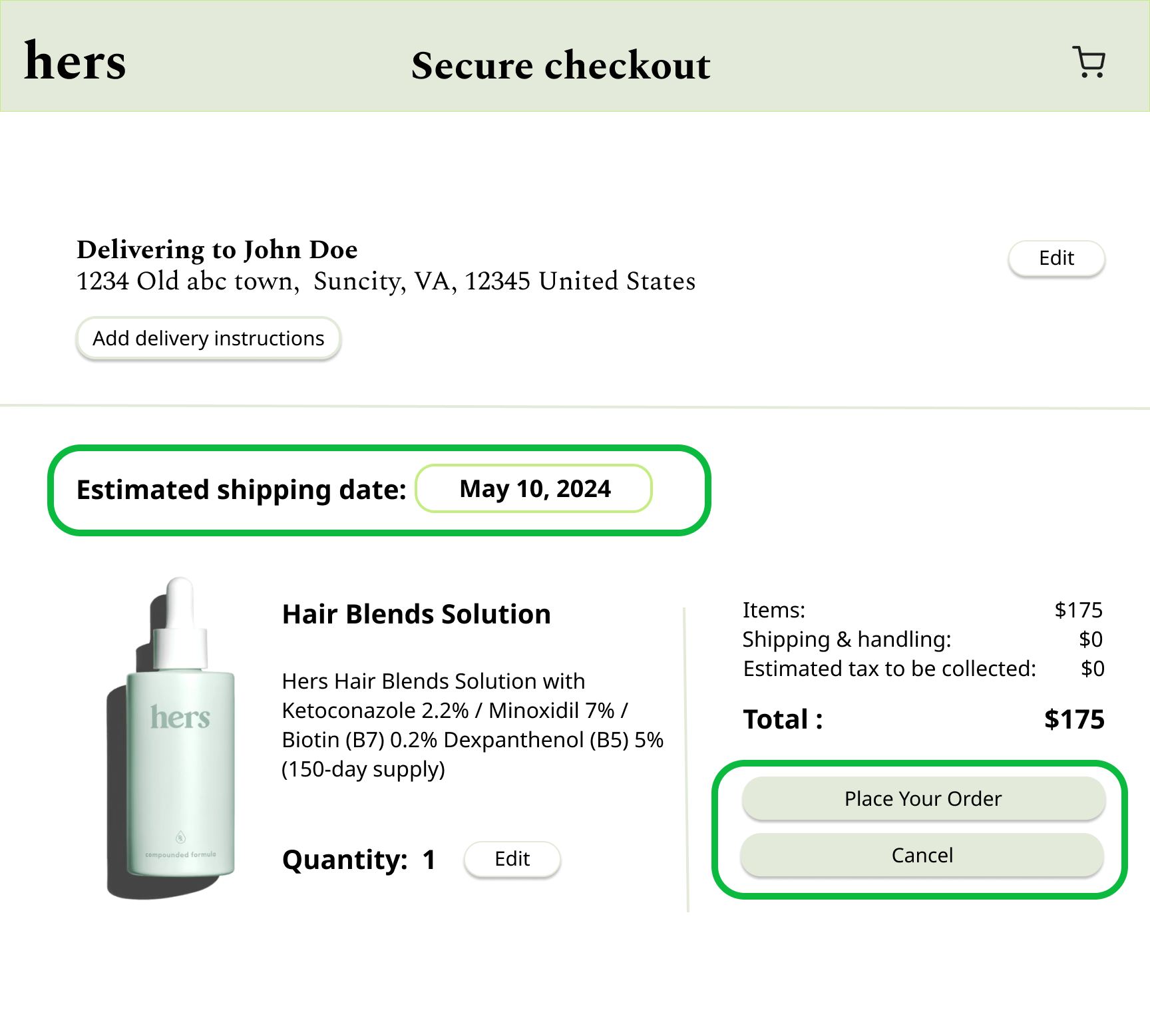

Solution: Add prominent “Place Order” and “Cancel Order” buttons on Order Checkout Page, and display the estimated delivery time clearly for easy access to critical actions.
Flexibility and Efficiency of Use
Provide efficiency options for expert users.
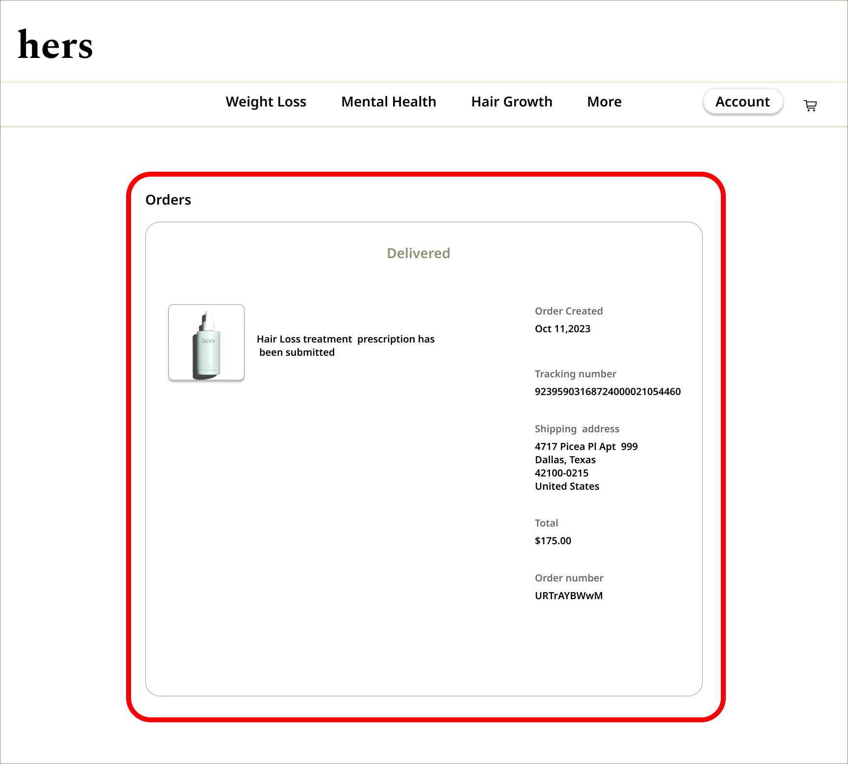

Issue: Experienced users have no shortcuts to check order statuses or navigate previous orders quickly.
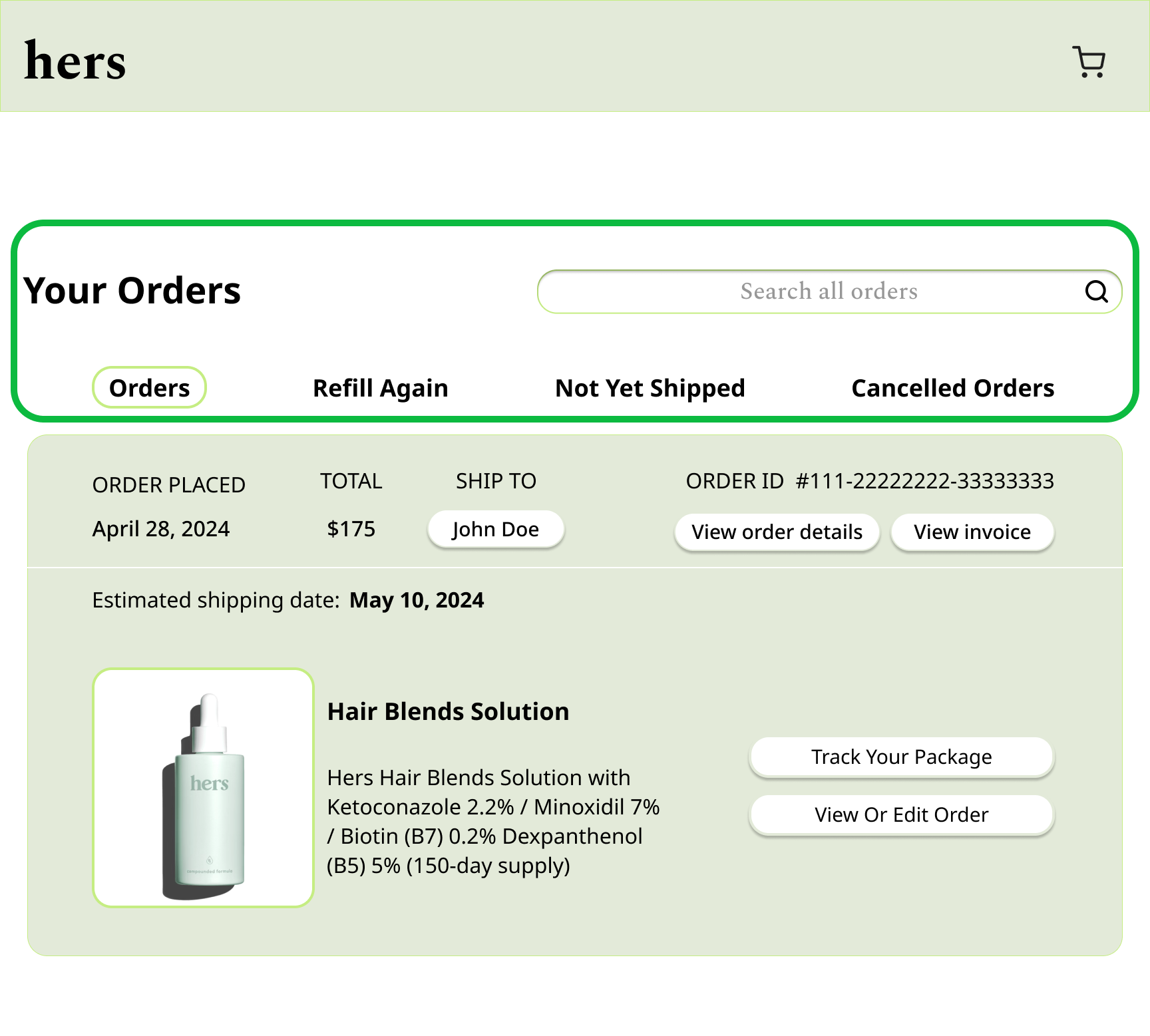

Solution: Allow users to filter and search orders by status or categories (e.g., active orders, not yet shipped, cancelled orders etc.)
Recognize, Diagnose, and Recover from Errors
Provide clear error messages and actionable solutions.


Issue: No clear messaging is provided for common user frustrations, such as searching for past orders or canceling an existing order.
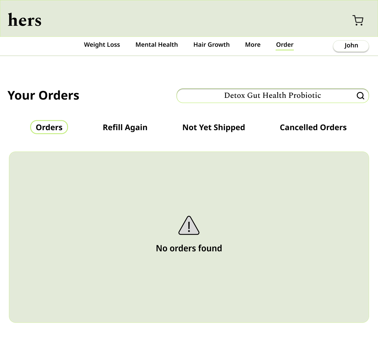

Solution: Include helpful messages like “No orders found” or display a clear error reason when cancellation is unavailable.
What I have learned?
I’ve learned the importance of aligning website design with usability principles like Jakob’s Heuristics to enhance user experience. Specifically:
1. Visibility of Key Actions: Users need prominent and intuitive options like “Place Order,” “Cancel Order,” and delivery time estimates to minimize frustration.
2. Minimizing Cognitive Load: Making critical information and actions easily accessible reduces the need for users to navigate or recall hidden features.
3. Improving User Control: Providing flexibility through clear cancellation and tracking options empowers users to manage their orders confidently.
4. Alignment with Expectations: Incorporating familiar design elements, such as search bars and visible navigation links, ensures ease of use and satisfaction.
These principles highlight the value of clarity, accessibility, and responsiveness in web design.
